QuickPay with B
Client
CYB
Project duration
2 weeks
Rate
£450p/d


Introduction
When looking to disrupt an industry, a new product shouldn't have to rely on a fancy brand or marketing material to get people's attention - they can help - but that's not disruption.
Real change comes from making people's lives easier; that's why people love digital products like Monzo or Uber. When working on B, we felt that there wasn't enough outside the box thinking and unfortunately too much trying to replicate what already existed elsewhere.
This is why we took it upon ourselves to give B the RAD treatment and create a feature to pay people via your mobile banking application in less time than it takes to post a social media status update.
Understanding the problem
B was launched to be Clydesdale Bank's attempt at a modern, industry disrupting fintech mobile application but for us, it wasn't as disruptive as it could be with many user flows identical to what you'd find in legacy banking applications.
Our research showed that people mainly use their mobile banking application for 2 reasons. 1, to check their balance and 2, to pay people. So why is it traditionally quicker to do one than the other? And why, in a new product, are we copying the same user journeys seen in traditional banking apps?
We needed a new approach to paying contacts, one that feels as accessible and natural as sending a Tweet.


Our role
As this was a self initiated project, this concept was researched, visualised, prototyped and presented completely by RAD.
This case study is an example of seeing the value of small deliverable features, making the most of available technology and delivering what users need. We pride ourselves on taking a different approach and coming up with big ideas that can add value to the projects we work on.
The design
One thing that we didn't want to do was move away from the B styleguide, we stayed on brand to show what could be possible without having a larger impact on existing marketing collatoral.
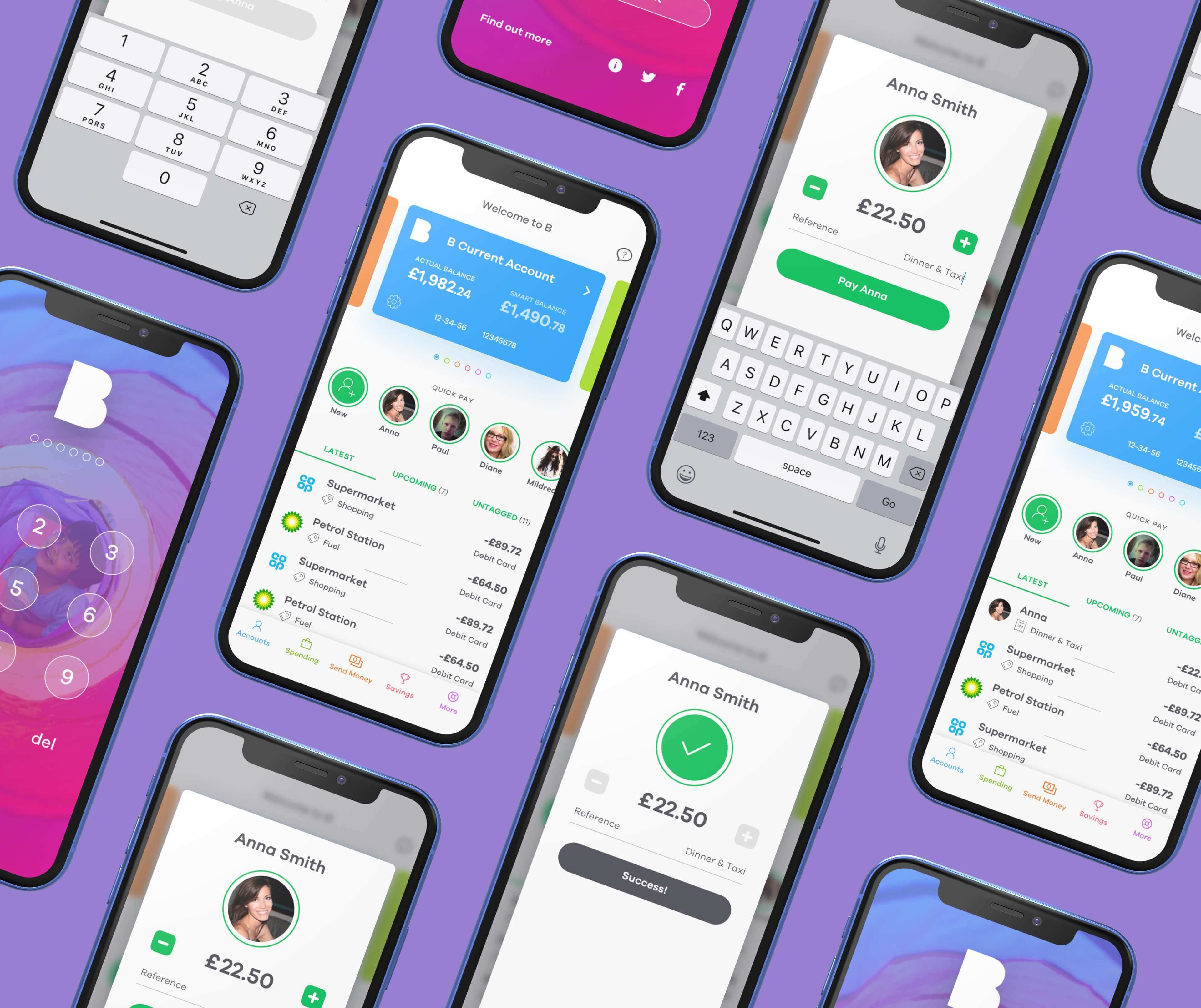
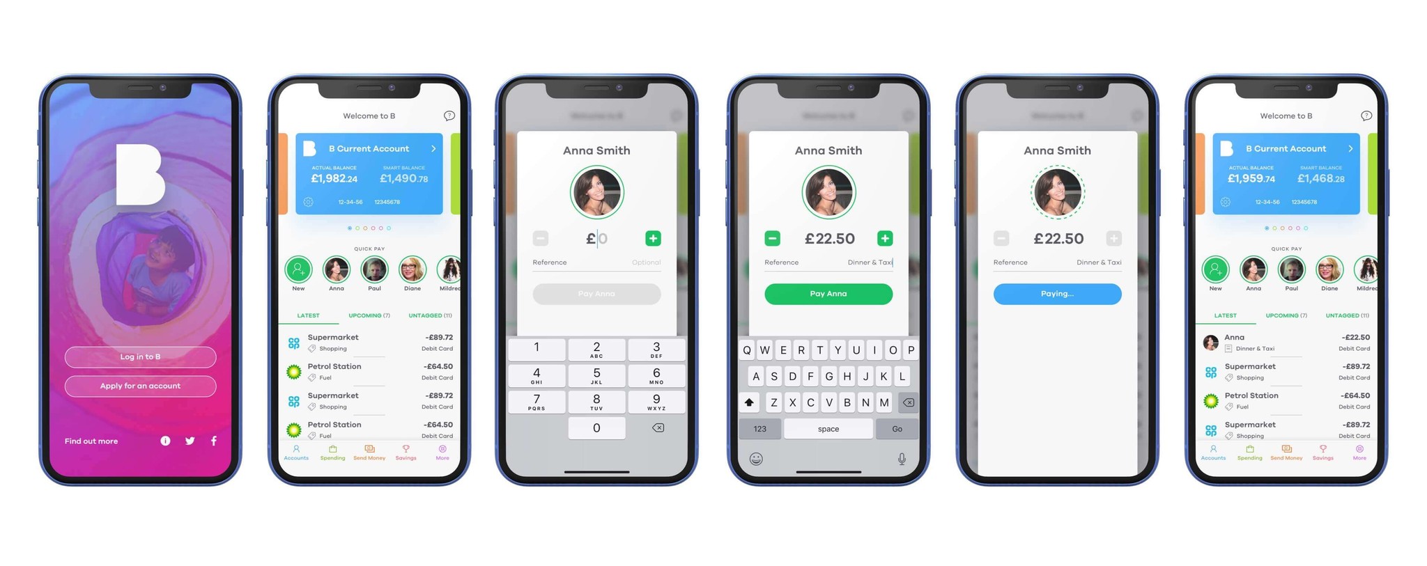
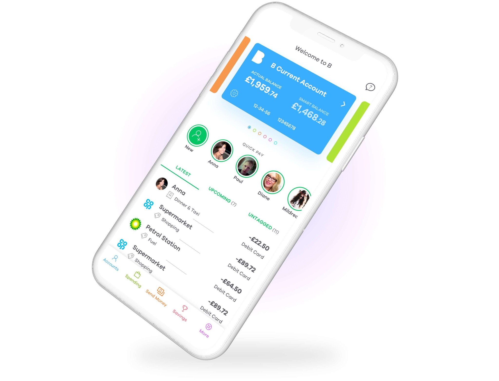
On the accounts section, the default screen the user would see upon logging in, we implemented avatars of the user's contact list and the idea was that by tapping one of these would trigger a quick payment to that individual.
We used a design pattern common in other social media applications like Instagram to show a row of contacts in order of when you last paid and/or most recently added them to the application.


Lessons
Whilst the feature wasn't able to be implemented due to the demands on the development team and the current product roadmap, we got great insight from pitching ideas such as this to senior stakeholders which led to a lot of positive feedback and as a result we became a go to about innovating what had already been built.
We've always found it valuable to present ideas to show the work that we're capable of, by approaching what seems like industry standard interactions and putting a new twist on them whilst taking a completely user centric approach.
Future scope
When we presented the Quick Pay feature to stakeholders at CYB, we referred to it as an MVP as we knew this could be iterated on to make it even better.
In the solution we presented, there was an assumption that the payments would be made from the user's default/current account.
So to give the user more control over where the payment was being made from, we could provide additional UI within the payment modal to give user control of where the payment was coming from.
We love building on good ideas and iterating to make things better.


Conclusion
As with most projects, there will always be room for improvement and it's highly unlikely that anyone gets it absolutely perfect first time. We showed what could be possible by looking at user pain points and with some creative thinking came up with a solution that no other fintech application had implemented at the time.
As our Netflix case study also showed, we're more than happy to work within existing design systems and guidelines and look for small changes that can make a big impact to the user experience.
Let's do great things together
To discuss projects, rates, services or availability, send us a message
Let's do great things together
To discuss projects, rates, services or availability, send us a message

© This is RAD
Founded in 2015

© This is RAD
Founded in 2015

© This is RAD
Founded in 2015