Netflix case study
Client
RAD
Project duration
2 days
Introduction
Imagine sitting down after a hard days work, wanting to find something new to watch but instead you've found yourself browsing an endless library of thumbnails for over 10 minutes.
You read the odd description, watch the odd preview but it's maybe not the right genre, or you don't have 3 hours to sit through a film. You are stumped.
This sounds familiar doesn't it?
Proposal
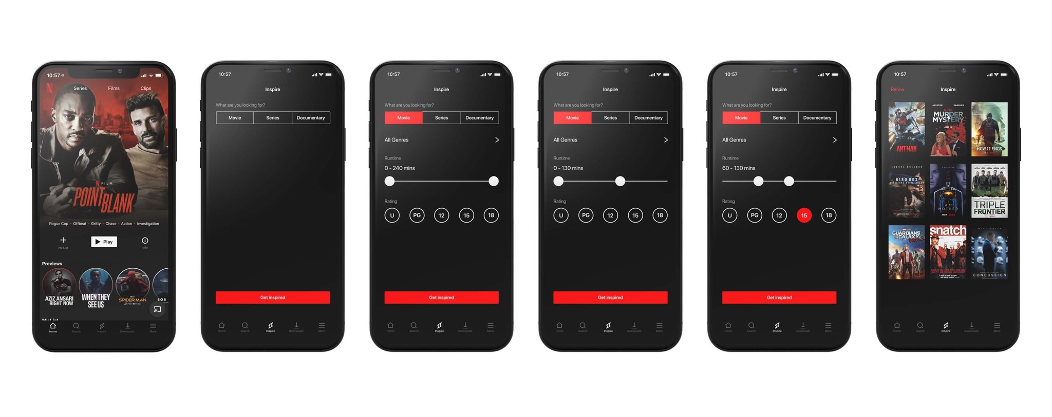
What we wanted to achieve, was an easy to access feature within the app that felt native to the Netflix ecosystem, was quick to use and helped people find something to watch quicker.
Proposal
What we wanted to achieve, was an easy to access feature within the app that felt native to the Netflix ecosystem, was quick to use and helped people find something to watch quicker.
Navigation
We designed an icon that compliments the current set of Netflix assets, striking and obvious. New, yet familiar.
Navigation
We designed an icon that compliments the current set of Netflix assets, striking and obvious. New, yet familiar.


User interface design
The UI of the Inspire feature leans on the existing elements of the Netflix user interface.
We used a segmented control as a way of progressively disclosing further options to refine the search. These controls are an easy way to choose between a movie, a series or a documentary before refining.


Benefits
The idea for this concept came from two particular frustrations whilst using Netflix.
Struggling to find media of a certain run time
As a result losing time endlessly browsing
The result of these issues generally led to not watching anything at all so with this concept we wanted to change that. The current Netflix search function is a simple text entry system, with this you already need to know what you're looking for or who you want to watch.
The Inspire feature at the most basic level is simply an advanced search, with fields that target the above pain points and get users to media they want to watch quicker.
It is a small feature that offers a very positive impact.
Future enhancements
This concept could be built out to include features such as a Netflix Originals checkbox. We may also take a look in future as to how this solution could work across the entire Netflix ecosystem.
Future enhancements
This concept could be built out to include features such as a Netflix Originals checkbox. We may also take a look in future as to how this solution could work across the entire Netflix ecosystem.


Results
We shared a presentation of the prototype on various social media platforms.
We were not surprised that the feedback reflected our own experiences of using Netflix. Whilst we focused our efforts in this occasion on the Netflix app, these ideas could be applied to most streaming services.
Results
We shared a presentation of the prototype on various social media platforms.
We were not surprised that the feedback reflected our own experiences of using Netflix. Whilst we focused our efforts in this occasion on the Netflix app, these ideas could be applied to most streaming services.
Conclusion
This case study is an example of the work RAD can do by alleviating pain points by implementing small, non-disruptive, changes to the UI to make a big difference in the UX.
We don't need to design projects from the ground up, we can improve products without impacting on existing brand guidelines or design systems.
Let's do great things together
To discuss projects, rates, services or availability, send us a message
Let's do great things together
To discuss projects, rates, services or availability, send us a message

© This is RAD
Founded in 2015

© This is RAD
Founded in 2015

© This is RAD
Founded in 2015